Nitpicking: KDE vs. Windows 7 window controls
I’m using Windows 7 a bit more regularly for gaming purposes now, so I thought I’d start on a series of articles about Win 7 vs. KDE. I’ve given up on GNOME until 3.0 rolls around, but once that’s out, I can do three-way comparisons 🙂
Today I’d like to nitpick on something. Observe the following screenshot from the top right corner of a KDE 4.3 window using the default theme:

And here’s Windows 7 with one of the default themes in green:
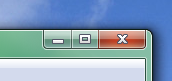
What do you notice? The window controls on Windows 7 are much chunkier. You get a whopping 50 x 20 pixel close button and quite clearly outlined icons on the buttons themselves, KDE only gives you a measly 20 x 20 pixel target area. The three buttons in Windows 7 are beveled and have a gradient on them, which doesn’t give very good readability, but at least the purpose of the close button is pretty clear.
I think Windows 7 does a better job presenting the window manipulation controls to the user than KDE 4.3: The icons are larger on Windows and thus easier to hit, and their purpose seems clearer. Of course this is arguable: Nothing in UI design is truly intuitive, that’s a myth, so you can’t say for sure that a small bar, a small rectangle and an X are any more intuitive than an up triangle, a down triangle and an X.
KDE loses one more point because the window control’s hot area (the clickable area) doesn’t extend all the way to the border of the window, and on hovering over the close box, the hover effect is barely noticeable. The users, especially those with less-than-stellar eyesight, are left guessing whether their next click will truly “take” on the close box or whether they still need to move the pointer a bit.
Still, I know that the KDE theme engine can deal with buttons of various sizes, and I’m pretty sure that I’ve seen an Aero-like theme with a wide close button. I’ll have to investigate.
Personally, I think the default KDE theme is a step back with 4.3 and Windows 7 (if you compare default settings) would win. I will crawl around KDE Brainstorm and pimp the idea of larger default window controls a bit.