Some years ago, I read a review of a GNU/Linux distribution where the reviewer, coming from Windows, commented that “some applications look slightly different than others,” and this person was puzzled as to why. I can guess why: One application was probably using the Qt toolkit and the other GTK.
Now the good news is that today’s GNU/Linux applications can look mostly the same if you pick the same theme in both worlds. Some distributions even make this automatic so you might never know you’re using applications with two different underlying technologies. But guess who has the problem of different application appearance today? Microsoft, in Windows 10! Look at the settings dialog:
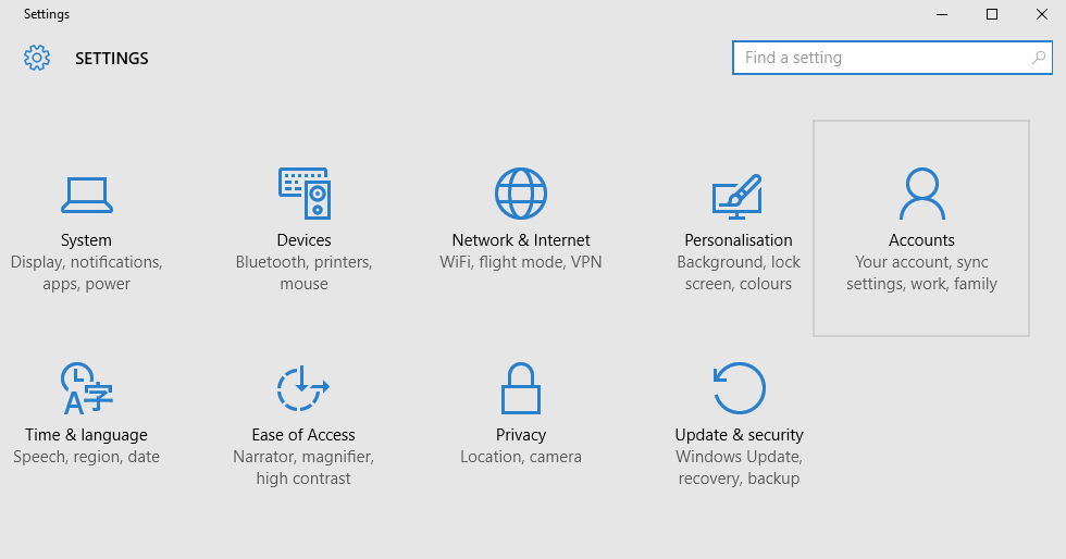
And the control panel:

See some things that are the same? Some that are different? Yet these two views coexist on the same system, at the same time. You do some stuff in one dialog and other things that are kinda the same but not quite in the other.
Only this time it’s a multi-billion dollar multinational company that’s using two different GUI toolkits in the very bones of their flaghsip operating system. I very much hope reviewers hate this and write about it as well, just to treat all things equally.
I’m not saying the problem is solved on the GNU/Linux side. I could write five paragraphs of hopefully constructive criticism. But it’s good to see that it’s no better even if you have billions to throw at the problem.
Update: I’m happy to see that reviewers have criticized and still are criticizing this severely.