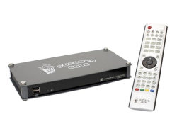
Good quality music from your PC, Mac or NAS: Music Streamer

Most PCs come with onboard audio circuits that, at best, sound OK.

But there’s a cheap way out of that. The Music Streamer by High Resolution Technologies. It’s an external USB sound interface with a very good D/A converter. This is a semi-audiophile device, yet it costs only about the same as your average USB audio interface these days.

This isn’t made for 5.1 surround sound, it only has two analog RCA (Cinch) outputs to hook up to your amp. Of course you can also play games in stereo on it and watch films. Both sounds crystal clear.

I’ve hooked mine up to my Synology NAS (it’s plug and play) and I’m running mpd on it, so no PC is required to listen to music. It can be controlled from any Android phone, a web interface or dedicated clients like Ario or ncmpcpp.

Best purchase of the year!

I bought the small version for CHF 120.00 (around USD 120.00), but if your ears are good enough to hear it and your equipment is good enough to reproduce it, you can go up to USD 900.00 on one of the higher-end models.

Sidegrading from Ubuntu 9.10 to Debian squeeze: It's a breeze

Since I’m switching many machines from Ubuntu to Debian, I was wondering if I could just keep my home partition intact and simply install Debian “over” Ubuntu, or if that would cause major problems with application configuration files etc.

Here’s the good news: It’s absolutely no problem to sidegrade from Ubuntu 9.10 to Debian squeeze (testing). I chose to keep the /home partition unformatted in the installer, but formatted the / partition. When the system rebooted, I logged in and my entire desktop looked exactly the same as under Ubuntu. Even my GNOME settings were intact, down to the desktop background.

The only thing I had to do to tweak was to install some software that doesn’t come by default with Debian, such as claws-mail, my favorite e-mail client. Other than that, it’s been extremely smooth sailing. I’m surprised, in a positive way.

So if you don’t want to follow Canonical’s rebranding of Ubuntu (which will happen with 10.04 later this month), give Debian squeeze a try. It’s fully community based, so if you think the Debian Project Leader is not acting in your best interest, you have more leverage than with Canonical to change things.

Nitpicking: KDE vs. Windows 7 window controls

I’m using Windows 7 a bit more regularly for gaming purposes now, so I thought I’d start on a series of articles about Win 7 vs. KDE. I’ve given up on GNOME until 3.0 rolls around, but once that’s out, I can do three-way comparisons 🙂

Today I’d like to nitpick on something. Observe the following screenshot from the top right corner of a KDE 4.3 window using the default theme:

kde_window_controls

And here’s Windows 7 with one of the default themes in green:

windows_window_borders

What do you notice? The window controls on Windows 7 are much chunkier. You get a whopping 50 x 20 pixel close button and quite clearly outlined icons on the buttons themselves, KDE only gives you a measly 20 x 20 pixel target area. The three buttons in Windows 7 are beveled and have a gradient on them, which doesn’t give very good readability, but at least the purpose of the close button is pretty clear.

I think Windows 7 does a better job presenting the window manipulation controls to the user than KDE 4.3: The icons are larger on Windows and thus easier to hit, and their purpose seems clearer. Of course this is arguable: Nothing in UI design is truly intuitive, that’s a myth, so you can’t say for sure that a small bar, a small rectangle and an X are any more intuitive than an up triangle, a down triangle and an X.

KDE loses one more point because the window control’s hot area (the clickable area) doesn’t extend all the way to the border of the window, and on hovering over the close box, the hover effect is barely noticeable. The users, especially those with less-than-stellar eyesight, are left guessing whether their next click will truly “take” on the close box or whether they still need to move the pointer a bit.

Still, I know that the KDE theme engine can deal with buttons of various sizes, and I’m pretty sure that I’ve seen an Aero-like theme with a wide close button. I’ll have to investigate.

Personally, I think the default KDE theme is a step back with 4.3 and Windows 7 (if you compare default settings) would win. I will crawl around KDE Brainstorm and pimp the idea of larger default window controls a bit.

A week with KDE 4.3

I’ve been using the new KDE 4.3 for a week now, and I think I’ll stick with it. There are still some issues to fix, but they are small things, I’m sure 4.3.1 will take care of them.

The fun I’ve had so far, and this is why I’d recommend trying KDE 4.3 to any computer user, is in the subtle little helpful things KDE does:

  • When you move a file to a folder that already contains that file, Dolphin (the file manager) will ask what to do with it. It even recognizes the file if they have different names! You can choose to skip, auto-skip, overwrite… No more manually trying to find duplicate files to interleave one directory with another.
  • In Dolphin, clicking on the filesystem path shown on top of your file list lets you edit it and manually enter paths. Very quick.
  • The widgets on the desktop are both silly and useful, depending on which ones you choose. I have the latest lolcats, Penny Arcade, XKCD and Nichtlustig comics on my desktop. But I also have a dictionary widget, the weather, a fuzzy clock (says “half past eleven” in so many words) and the files in my homedir. I can also add the files from my former desktop directory, and they show up in orderly fashion. Compare this to your average desktop, where there’s just clutter and no real useful features. In the worst case, I can glance at the weather and some lolcats. In the best case, I’ll quickly navigate to a file I was looking for.
  • Dolphin as file manager is amazing. I can have OS X-style columns in the window, then split the window and have your usual detail view on the right half. I can mix and match view modes as I please and use the one that’s best for each situation. When navigating the hierarchy a lot, column view might be good, but when sorting audio files from left to right it’s better with a side-by-side detail view.
  • Alt-F2 (this is freely configurable) brings up a quickstart dialog that is really powerful. If I enter “fire” and hit enter, firefox will launch. If I enter “22+3=” the bottom of the window will show “25”. If I enter “Ruben” and some Rubens are in my address book, one of the choices will be “Write e-mail to Ruben”. If I enter “gmail”, my Gmail opens because I visited that site in my browser once before. This is all done 100% automatically and transparently, without any configuration. I’m sure if I configured this thing, it would be even cooler. Very, very, very fast working is possible this way.
  • Kate is a wonderful text editor, it has probably the most beautiful code folding I’ve ever seen.
  • Choqok and other social networking tools integrate nicely with the desktop and also make use of the cool notification feature.
  • If your machine is doing something in the background (copying a bunch of files), your screen isn’t cluttered up with useless progress dialogs. Instead, all current tasks are summarized in the lower right corner in your notification area. Once the task is finished, you will be notified. If you want to look at the progress, hover your mouse over the notification area.
  • I have OS X’s Exposé and other window management features at my disposal, but I don’t need to use OS X for them 😛

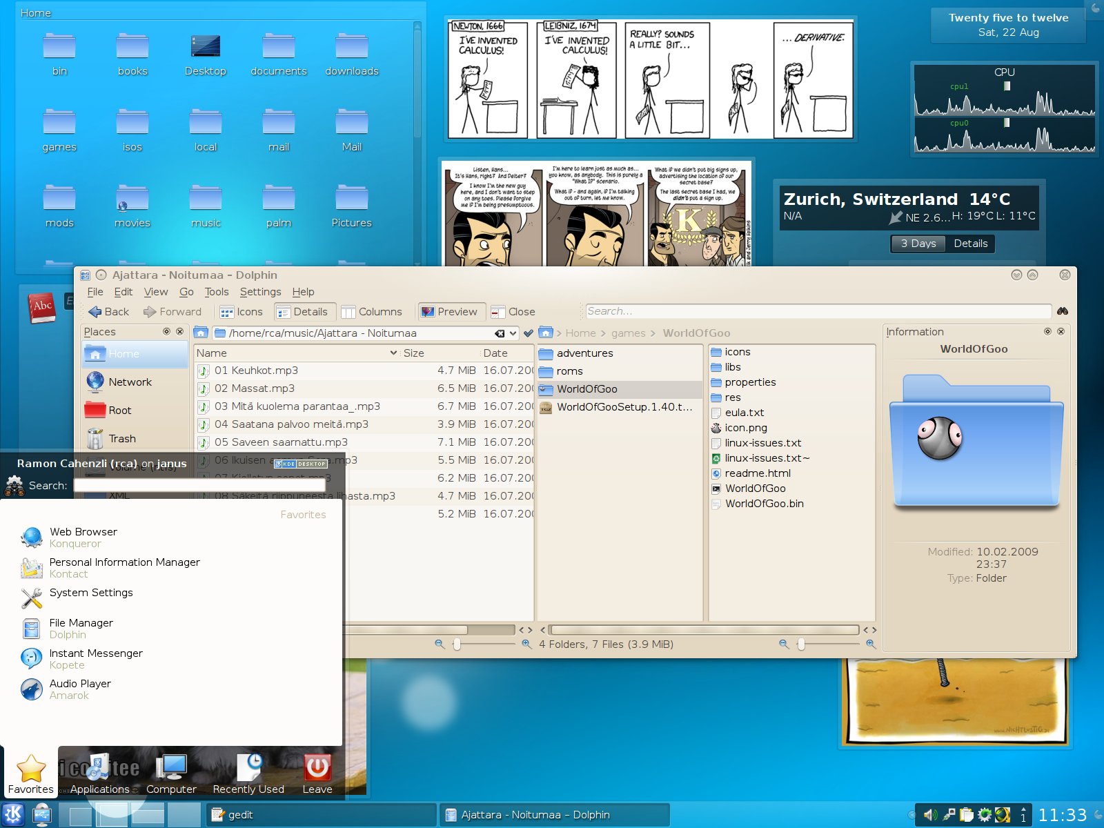
Check out this screenshot of my desktop:

kde_43_rca

The kickoff menu in the lower left is very convenient as well. I think you can see that I’m very happy with KDE 4.3. If some of the issues (like the WLAN network manager that can’t connect to corporate WPA2-TKIP networks) are fixed, I see no reason not to recommend this stuff.

Checking out KDE 4.3 – it's a winner

If you have Ubuntu, give KDE 4.3 a try or check out some information first.

I’ve followed the KDE development since version 1.0. I remember installing it in circa 1999 on a PowerPC machine with a 200 MHz 603e and 24 MB RAM, and it ran faster than the native OS I had on that box, Mac OS 7.6.

When the KDE team hit version 3.0, I thought development got very slow, KDE itself slowed down as well, and things weren’t looking great all in all. Now that I’m trying KDE 4.3, I’m surprised at every corner. This thing rocks. It’s fast, it’s quite different to any other desktop, but extremely configurable. I can set this thing up to work like Mac OS X, like Windows, like a mix between the two, like none of them. I can add the latest lolcats to my desktop in a widget, with a dictionary and my home dir next to it, and they’re available at the push of a button.
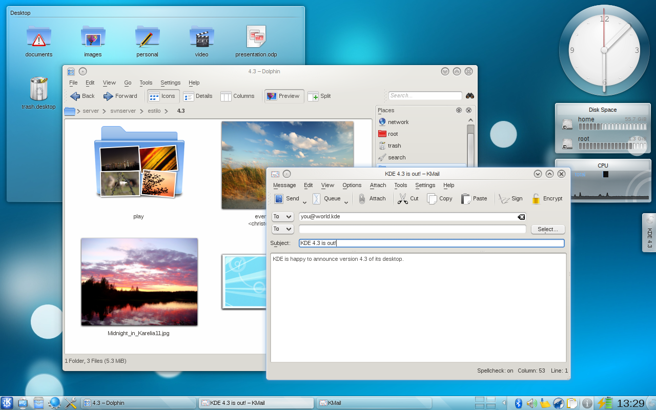
kde430-desktop

I have a solid copy of OS X’s Exposé, I have UNIX’s own 3D desktop cube, I have Windows Vista’s flip-through task switcher (if I like. I use a simpler one, though). I mix and match all this until it’s my own perfect desktop environment. And if you think it’s hard: I haven’t looked at KDE since KDE 3.x, and that was years back, and I have much more trouble finding things on a Vista desktop (which I also never use) than I had on KDE 4.3. Most settings are where you expect them, and most things do what you’d like them to do. It has the right functionality, and the functionality is right where you expect it.

It’s also the best-looking desktop environment I know, with very clean lines, meaningful icons and widgets and a quick and useful file manager. I haven’t even mentioned the fantastic music player Amarok, but that would require its own article.

And on top of it, all this comes with full source code, runs on Linux, BSD and I think even Windows, and is published under a free software license.

Bravo!

Update: I’ve been using KDE 4.3 now for about six hours, after more than three years of GNOME. I think I’m staying with KDE for now. This is smooth as a baby’s arse. Amarok is integrated into the system so tightly, I have keyboard shortcuts to control all my music, my desktop is full of widgets that are actually useful or entertaining instead of pointless, my file browser works better than ever before… This is the surprise of the year for me.
How competition in the browser market helped all of us

browserlogos

Remember the 90s, when Microsoft had illegally established a dominant position in the browser market and the dominant browser was MSIE? You might think that was harmless, but it has caused several problems:

  • No competition means websites were written for a specific browser instead of to a standard (that the W3C publishes)
  • MSIE (purposefully?) broke this standard in order to make sites written for MSIE incompatible with other browsers and further strenghten Microsoft’s position
  • MS started adding tags to MSIE that didn’t exist on any other browser. Not for the good of mankind, but to lock people onto the MS product
  • Lack of competition meant that innovation stagnated
  • There are plenty of security holes in MSIE, and there was little incentive for MS to fix them
  • Ask a web developer to tell you just how broken MSIE’s HTML rendering engine is

Yesterday, the Mozilla Foundation released Firefox 3.5 with many new features (mostly under the hood) and speed boosts. People have noticed this new competition and are no longer happy with an old and broken browser like MSIE 6.0, which used to be the default for many. When we look at our website stats at work, about 35% of our users use Firefox, another 35% use Safari and only 25% use Internet Explorer (either 6, 7 or 8). This is excellent news because it is living proof of competition. Competition gave us many improvements:

  • Stability on the web has much improved. Google released their Chrome browser, which runs a separate process for every tab you open, so that only the affected tab crashes if e.g. a plugin messes up, like Adobe Flash often does. Other browser makers are following suit.
  • Google’s Chrome had an extremely fast JavaScript engine, making JavaScript-heavy sites such as Flickr run faster there. There was little competition in this area before Google started the race. Now Firefox 3.5 has caught up with Google Chrome 1.0 in speed, and further improvements in all camps (including MS) can be expected.
  • Mozilla’s rendering engine (Gecko) and various JavaScript engines have been ported to all major platforms. Developers for those platforms have an excellent, open source rendering engine available to use in their projects.
  • The KDE Foundation’s HTML engine (KHTML/WebKit) is used by Apple in Safari and on the iPhone, by Nokia on their mobile phones etc. It’s another Free Software HTML rendering engine. So even among Free Software engines, there is competition!
  • Security is much improved, as pointing at security holes in the competition’s browser can now be used as a marketing tool. Browser developers have improved their QA processes and even Microsoft no longer allows itself six years to fix the browser.
  • Web developers had been frustrated with MSIE’s broken HTML renderer for years. Since there is competition, there is pressure on Microsoft to start following the web standards. Firefox, Chrome, Opera etc. do a much better job at using web standards, but no one cared for a long time since they had to write broken HTML code in order to support MSIE users. Now web developers discovered their pride, started writing according to web standards (with the help of influential figures like Jeffrey Zeldman) and boom, suddenly good standards support is an important feature for a browser. Someone obviously woke up the developers at MS as well, because IE 8.0 does a much better job at standards support than the previous versions.

So if you ever think “bah, it doesn’t matter that there’s a monopoly, I wouldn’t be better off without it”, think of these points. Yes, it does matter. The lack of competition in key IT markets makes a big difference. Imagine if we had the same situation in operating systems as we have with browsers, a 30/30/30/10% split of the market. Standards would be followed more closely, systems would interoperate better and there would be an actual incentive to innovate and improve. And most importantly, you as an individual or company would have more choice.

Some people think this is just a mantra repeated by free-market fanatics, but it is true, as you can see with your own eyes in today’s browser market, with just the few examples mentioned above. Oppose monopolies in computing. They are bad for you.

Edit: Just one day after I posted this, Microsoft was again caught abusing its power. They are deploying a program that changes people’s default search engine from whatever they have selected (perhaps Google?) to Microsoft’s own Bing. The user is never asked whether they want this change, unless they have third-party software installed that alerts them to such changes. You see that anti-competitive actions by monopolists are still happening in this industry.

Logos used in the image above are the property of their respective owners.

More than half of Standard Norge resigns over Microsoft OOXML fiasco

After the Norwegian ISO standards body, Standard Norge, accepted Microsoft’s MSOOXML file format even though only two of 23 members voted in favor, it became clear that some manipulation had been going on behind the scenes.

Apparently, nearly 40 strong and powerful Microsoft partners had sent identical letters to Standard Norge urging them to adopt MSOOXML, and Standard Norge’s own expert committee’s strong vote against the format was simply ignored.

Now 13 of 23 members resigned in protest of this and of other irregularities in the voting process. From the open letter of the resigning members:

  • Administrasjonen i Standard Norge har valg Ã¥ vektlegge 37 likelydende brev fra Microsoft-partnere mer enn sin egen fagkomité.
  • Prosessen i Standard Norge har vært uforutsigbar og spillereglene har blitt endret av administrasjonen underveis.
  • SN og ISO har begÃ¥tt en rekke brudd pÃ¥ sine egne regler og andre uregelmessigheter i OOXML-prosessen.

Quick pseudotranslation: The Standard Norge administration trusts 37 identical letters from Microsoft partners more than their own expert committee, Standard Norge’s process became intransparent and the rules of the game were changed during the process, SN and ISO have committed a series of breaks of their own rules and allowed other irregularities during the OOXML process.

As a voting member during the Swiss OOXML process, where we have observed strange happenings as well, I respect and applaud the 13 members of Standard Norge for their courage. I am also very happy that the industry is now questioning the integrity and usefulness of the various ISO standard bodies in light of all the inexplicable vote changes and other indications of corruption that appeared during this time.

KDE 4's ultra-sexy text editor control

I like simple editors and use Kate a lot. It’s like Kdevelop, but without all the additional baggage. It does syntax highlighting and indentation just fine, and it has code folding and can comment and uncomment entire text blocks. If an editor has all of that, it’s already making me very happy.

kde4_text_widget_beauty.png

I was curious to see what will change with Kate in KDE 4, so I installed the KDE 4 version today on Ubuntu 8.04 (Hardy Heron), since it’s nicely packaged there. The screenshot above is from that version. Just wow. Text display is crisp and look at those code folding depth indicators (the gradually greener line on the side). When I took the screenshot, I was hovering my mouse over the greenest part, which highlights the block at this depth. The triangles let you fold code, of course.

Beautiful, isn’t it? And they must have done something to text rendering in Qt4, because the text elsewhere in the window looks sharp enough to cut entire horses in half. I can’t wait for KDE 4.1: maybe that’ll be a reason to switch the whole desktop like Shane is currently trying. The least I will do is switch to the KDE 4 version of Kate already 🙂