This isn’t just an excellent 2D action roguelike game, the developers also used the correct colors on medkits:

Green and white, as it should be. Kudos, Motion Twin. Well done.
Brutal Doom fixes one of the problems in the original Doom, namely the use of the wrong colors on medikits. While Doom on its own ignorantly uses the Red Cross symbol, if you add Brutal Doom to your game, it’s turrned into the correct first aid one:
That makes Brutal Doom not only better than vanilla Doom in every way, but also more accurate than the latest Doom outing, Doom Eternal.
Brutal Doom is available for free at ModDB but requires original Doom WAD files to work.
In these trying times, here’s an example of correctly labeled equipment from a recent press conference:
On the top you see the Swiss emblem marking these as Swiss federal/army items, on the bottom the Red Cross marking them as medical equipment in a conflict.
Stay strong and stay inside.
With such a medical theme at the heart of this game, you’d almost expect Fractional Games to get the first aid colors right. And they did! Here’s proof:
Congrats! If only all developers were this well-informed.
This is the second Swedish developer to use the correct colors, Easy Trigger Games also got them right in Huntdown.
Not much to say here except to drop some praise: The first aid chests have the correct colors! Hurray! See them smack dab in the middle of this screenshot:
Screenshot stolen from Mack’s review.
Ah, some reason for praise again. Look at the health potion in the lower left corner of this screenshot from Mack’s Worth A Buy review of Strange Brigade:
Notice something? The potion may be red, but the first aid symbol on the tag has the correct colors! Rebellion Development seem to be capable developers in this regard. Cheers!
Ooooh, Blizzard. Cheeky little Blizzard! I see what you did there. In their game Overwatch, Blizzard cunningly sidestep any flag confusion by basing a medic character called Mercy in Zürich, Switzerland. That way they can use the Swiss flag on her, which Americans foolishly believe is a medical symbol, yet Blizzard remain completely correct in their symbology:
They even got the flag proportions more or less right. Very clever indeed.
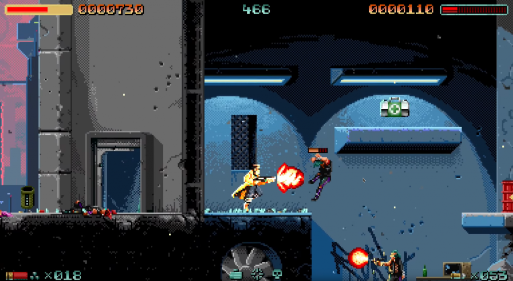
Upcoming run-and-gun 80s synthwave extravaganza Huntdown is already pleasing me immensely even though I’ve never played it. Because developers Easy Trigger Games used the correct colors for first-aid kits:
We went from one single praise post per year to several a month now. I’m not sure if this is pure chance so I reached out to Easy Trigger Games to ask them about it.
Tommy Gustafsson from Easy Trigger had this to say: “We do not leave anything for chance. And off course we would never misuse the Swiss flag, isn’t this common sense? 🙂 We are also tired of people around the world mixing up Switzerland with Sweden, which is the country we come from. And no, there ain’t no ice bears here neither!”
That goes to show, meticulous developers will always get it right. Thanks, Tommy, for the inside information!
If you know this blog, you know that there is very little reason to praise game developers, since most of them get the first-aid kit colors wrong. But not this one. Unbox: Newbie’s Adventure by Prospect Games even uses correctly colored first-aid kits in this promo shot, look in the lower right corner:
They’re also that way in the game. Hats off to you, Prospect Games.